Common UIs
Common UI components are the building blocks of your interface. This page showcases reusable elements like Buttons, Cards, Modals, and Badges — all crafted with Tailwind CSS and optimized for Next.js and React.js projects.
Use them to build fast, consistent, and visually appealing user interfaces across your application.
App Logo
Avatar
Button
Badges
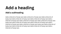
Typographies
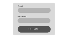
Forms
Notification
Modal
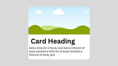
Card
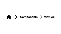
Breadcrumb
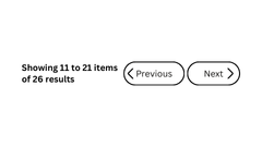
Pagination
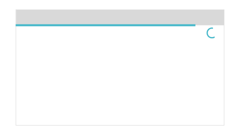
Top Progress Bar
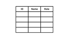
Table
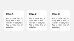
Item Grid
Youtube Video